“Hey, for our band logo, why don’t we use Comic Sans?” – SAID NO METAL BAND EVER!
I get it, there is nothing metal about Times New Roman –or any other font that is legible for that matter –but as a cixelsyd, sorry dyslexic, I even get that word backwards; I need to know: How did bands go from “I want everyone to see our band name!” to “Who needs PR? Let’s make it so not even a calligrapher could decipher what this logo says!”
Well, I, being the world’s most prolific satirical-metal-goblin-journalist, was ready to get to the bottom of this; I was ready to forge my way into the font!
After some extensive research in the library, and by library, I mean the digital library, and by digital library, I mean Google; I was surprised to learn that the idea of a gothic text dates all the way back to medieval times. No, not the rockin’ dinner theatre with the giant chicken legs and hunks on horses, I mean the actual medieval time period. Like Game of Thrones, but real, and with a better series finale.
My guess is, during those times, knights were so hopped up on mead and the plague that they were attempting to write legibly but instead made every letter look drunk, and then the oppressive heat made the ink drip down. I’m sure somebody saw it and said, “Now, that’s metal.” Which he probably meant literally, since the guy writing it was in head-to-toe armor.
This would come to be known as Gothic script, or Blackletter, which both sound like they could be playing Ozzfest next year. “Dude, Blackletter rips!” This is what metal historians, or as I call them, Nekro-historikons, call the beginning of goth’s obsession with the color black, which, as you know, would one day become Black Metal. And I was as shocked as you to learn is comprised mostly of white dudes, I guess “Pale Metal” didn’t have much of a ring to it.
We are now going to jump to the late 1960s; not much really happened between these time periods –a bunch of wars and death, which is pretty metal, but honestly, the music was terrible. You guys ever listened to jazz?!? Like, what? Just a bunch of dudes in zoot suits refusing to write a chorus? NO THANKS!
The year is 1968 when a band forms in Birmingham, UK, on a Sunday, I believe. Or as the Christians call it, the sabbath. Well, they took that day and decided to give it a medieval twist, and BLACK SABBATH was born! They took their guitars and forged them in the darkness! They dipped their drumsticks into the devil’s ink! They bought a one-way ticket to a crazy train!
What’s that?
“Crazy Train” isn’t Black Sabbath, it’s actually from Ozzy’s solo era? Well, OFF WITH YOUR HEAD it fit the motif, OKAY?!?
We are now going to jump to the 1970s: not much really happened between this time period either – a bunch of hippies, flowers, and Tom Hanks, Kevin Bacon, and Bill Paxton attempting to land on the moon, got stuck, and had to get Ed Harris to help them back home. However, soon enough, bands like Iron Maiden and Judas Priest started to break us free from tyranny of the basic-ass-font Hell-vetica (font joke!) we were living in, pushing letters past their typeface blocks for an aesthetic that kinda looked like it was drawn on a 3-ring binder in Sharpie by a high schooler. Yet, one would argue, these logos were still legible.
Guess we gotta keep time-traveling? I’m exhausted!
We are now going to jump to the 1980’s: not much really happened between this time period either – a bunch of mustaches, disco, and a big ol’ dick, which some called Richard. Apparently, he was some president and tried to stop a leak with a fence, later they called it “Water Gate?” HISTORY! I think we’ve finally reached our destination, because it was in this decade that the anti Pale-metal emerged. It was time for…

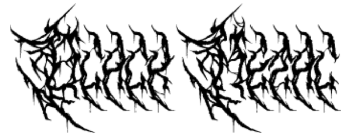
If you’re saying to yourself, “I can’t read what that says,” –I THINK YOU MADE MY POINT FOR ME. It says BLACK METAL, but you can’t read it which is BLACK METAL’S FAULT. It didn’t stop there, bands begin pushing it further and further, to the point festival posters might as well be brail!
Which band are you most excited to see above? “Uh… the squiggly one?”
We are now going to jump to 2026 – not much really happened between this time period either, humans became more reliant on robots and trashed the planet.
So the question remains, WHY are we obsessed with the wild, hard to read fonts? I’ve been scratching my hump trying to figure it out.
Then it struck me, OH MY GOB, it’s not about how the font looks, it’s how it FEELS.
Bands aren’t concerned with somebody knowing the name of their band, they are focused on giving you a feeling, and the font reflects that feeling, and that feeling is METAL, be it black, death, doom, thrash, goblin, or dare I say, pale.
So, next time you’re at the merch booth at a metal festival, putting on your third pair of reading glasses, whipping a magnifying glass out, trying to decipher which shirt belongs to which band… DON’T. Just hand the merch guy or gal or theydy a wad of cash and say, “Hey… give me the squiggly one.”
